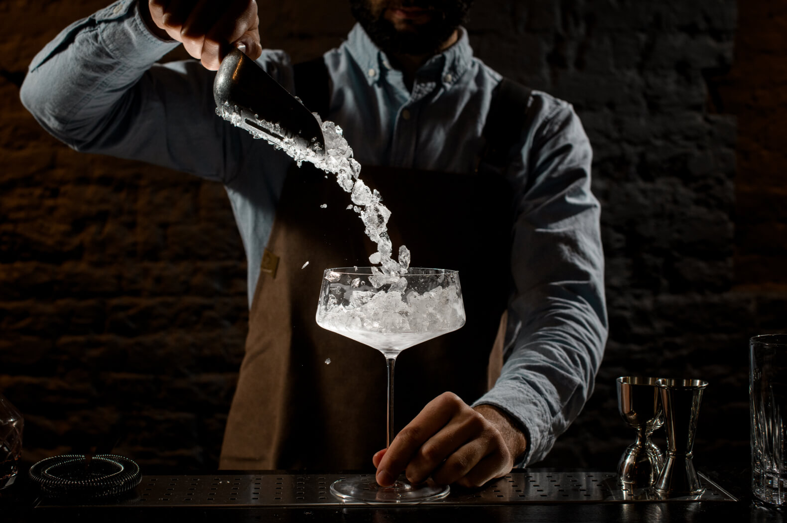
Craftails offers premium, ready-to-serve cocktails. Conceived, pre-tasted and developed by the top 3 bartenders of Belgium and also the founders of Craftails: Yannick, Sofian and Naushad. You might recognize Naushad from the popular program "It's Aperotime" on Njam. Together, they ensure that every catering establishment in Belgium (and beyond) can serve cocktails of an unparalleled quality. Not only is the taste exceptional, but the branding of Craftails is also impressively on point.


The needs
"What does Mendeliev's table have to do with cocktails?", we can already hear you wondering aloud. That table may look familiar from your high school chemistry class. In case you've forgotten, the periodic table consists of chemical elements, 118 in total (or 122 if you include those not found on Earth).
Mendeliev's table is the starting point for Craftails to build a rock-solid brand. What exactly Mendeliev's table has to do with cocktails, you can read below.
Our trajectory
Mendeliev's table consists of various (chemical) elements, much like a cocktail. But which and how many elements? Let's go! We began by dissecting a cocktail and discovered no less than 6 elements: The Six Senses.
On the other hand, The Six Senses are also a reference to the Six of Antwerp. This is a group of well-known, Belgian fashion designers who have put Flemish fashion on the international map.
The Six Senses are not coincidentally a nod to the Antwerp Six. The three founders of Craftails are also from Antwerp. Antwerp is often associated with hip, fashionable, hot spots galore, shopping ... Therefore, classic branding would be wasted on Craftails.
The look and feel of the brand has to fit all these elements, as does the baseline. Not to worry, we quickly came up with the perfect baseline for Craftails: "The experience that awakens your senses."


Geometry, patterns, symmetry, feeling, color and taste.
You can apply the Six Senses we discovered earlier to any well-made cocktail.
Thanks to the Six Senses, we recognize patterns, symmetry and geometry in every cocktail.
All the elements we have collected throughout this process are now brought together in the concept. Based on this, we developed the logo. In the logo you clearly recognize the top view of a glass. The patterns we saw while dissecting the cocktail reappear within it. You can also recognize an ice crystal in the logo. An essential emotional trigger for anyone who loves a good drink.
In addition, it is a very powerful logo because this is a ruler brand. Even small, it remains very clear and recognizable. It is also dynamically versatile and integrates seamlessly into any design.
The entire branding must form a whole and the font is a very important factor in this. There are thousands of fonts: from classic to modern to expressive. We ultimately selected the font "Righteous."
Why exactly did we choose this font? You recognize the combination of a circle and triangle in the letters, which is yet another reference to the Six Senses that make up each cocktail. Moreover, this font also fits very well with the geometric concept we aim to convey. For those in the know, the font also resonates with the Bauhaus style, more on that later in this text.
Those in the know had probably already recognized Bauhaus influences in this branding. Bauhaus was a German art school where architects, artists ... could train from 1919 to 1933. Although the academy existed for a relatively short time, it had a profound impact on architecture and design worldwide. Even today, you often recognize elements of the Bauhaus style in various designs. The school is known for its specific approach to design. A combination of form and design with products from everyday life. Linear and geometric forms. A timeless and modern style. Revolutionary.
The look and feel are consistently reflected across Craftails' social media channels. The logo, text and images are combined harmoniously, creating a strong brand with impactful communication. Successful, right?
And that's why we also collaborated with Bauhaus for the branding of Craftails. The shapes in the font and logo refer to Bauhaus in addition to the Six Senses.
Modern. Aesthetic. Geometric.
The future
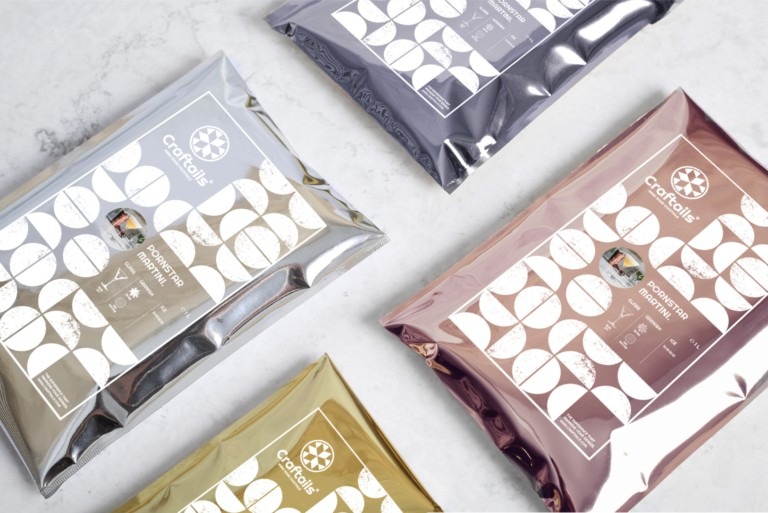
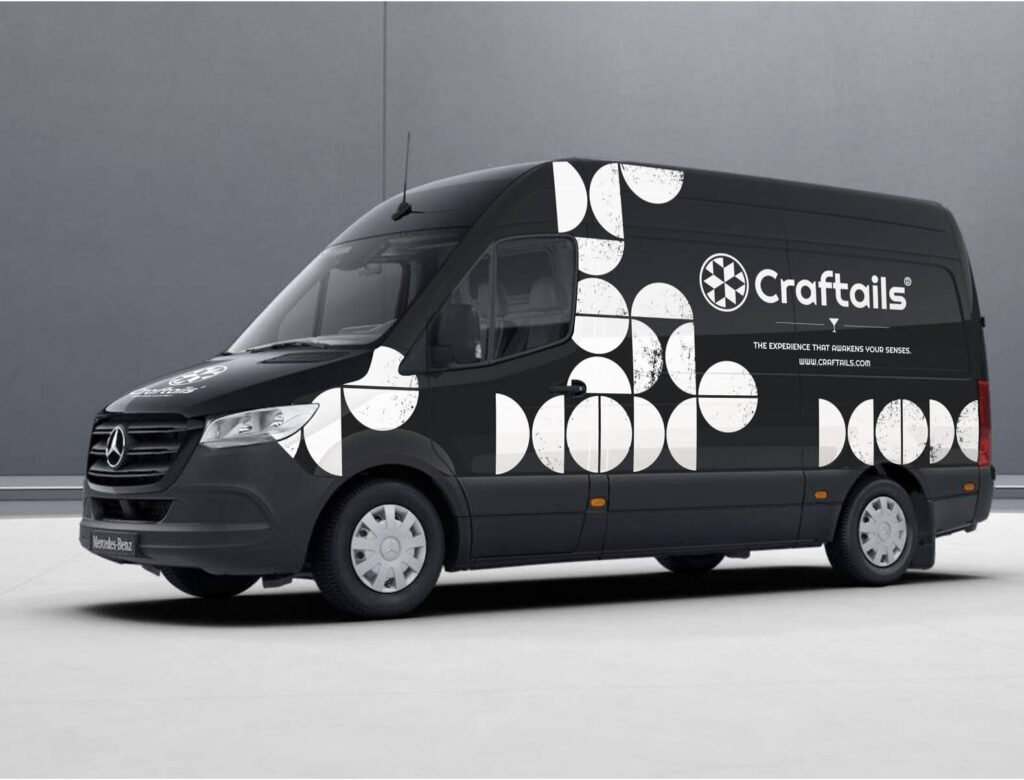
The design aligns perfectly with the essence of Craftails and can be used widely. Whether it’s the cocktail packaging, the business owners' name tags, or even a van, anything is possible. Craftail is a strong brand with a memorable look that leaves a lasting impression.
We use cookies on our website to provide you with the most relevant experience and personalized ads by remembering your preferences and repeat visits. By clicking "accept all," you consent to the use of all cookies. However, you can also go to "Settings" to give controlled consent.